ColorSmart In-Store Kiosk Innovation
Bridging In‑Store and Mobile Color Journeys
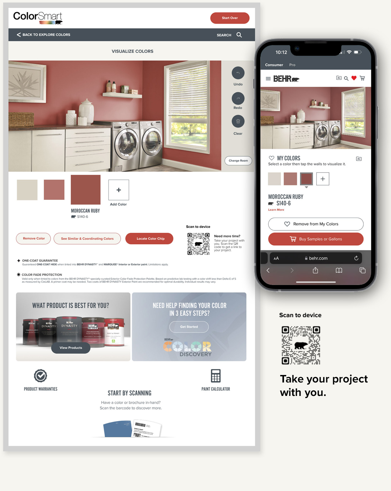
“Take Your Project With You” - Cross‑Device Project Continuity
A recurring question from The Home Depot leadership—“Why can’t I take my project with me?”—sparked a complete rethinking of how the kiosk and mobile site could work together. I developed a parameter‑based URL system capable of reconstructing a user’s project state on their phone, and partnered closely with our engineering team to validate the hypothesis through a working prototype. That collaboration ultimately triggered a larger web development effort to align the mobile experience with the kiosk’s content and structure, making true cross‑device continuity possible.
Every interaction on the kiosk updated a dynamic QR code containing the full project context. Scanning it instantly loads an identical version of the project on the BEHR mobile site, allowing customers to save, share, or continue their work at their own pace. This feature bridged the gap between in‑store exploration and at‑home decision‑making, creating a seamless, cross‑device workflow.
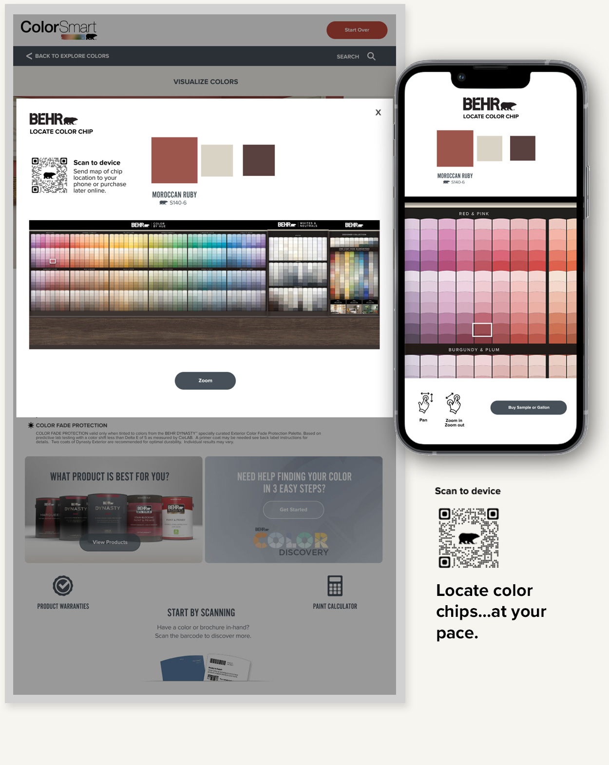
“Find Color in Store” - Solving the 30‑Second Timeout Problem
The kiosk’s mandatory 30‑second timeout creates a stressful moment for users trying to locate physical color chips. If the kiosk reset, their suggested colors disappeared, forcing them to start over.
To remove this friction, I extended the mobile integration to include a “Find Color in Store” feature. Suggested colors were encoded into a QR‑driven URL that opened a mobile map of the color center, highlighting color chip location. Users could now take their time browsing without fear of losing their selections. This feature also benefited mobile‑first customers, who could pull up their saved projects in‑store and navigate directly to the colors they needed.
Executive Presentation
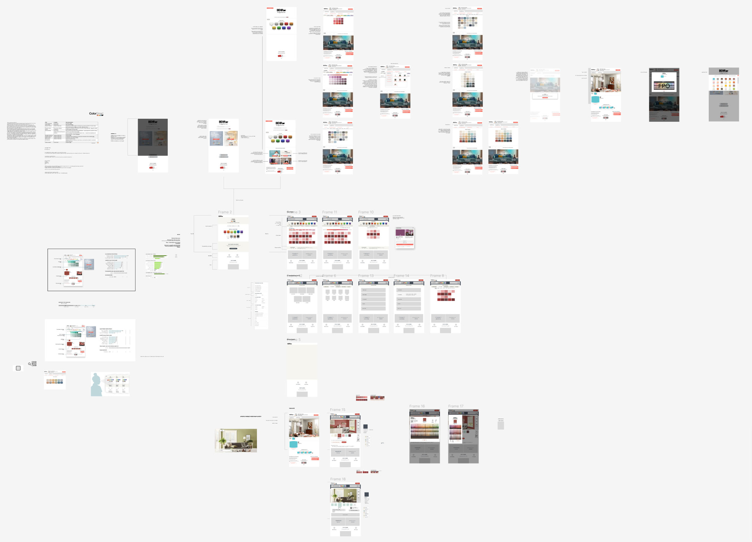
During executive leadership reviews, the cross‑functional team presents research findings, shop‑along insights, user‑testing results, and in‑store observations across all channels. My portion of the presentation focuses on visually identifying the key UX problems within the current kiosk flow and outlining clear, data‑supported paths to improvement. Using an interactive Figma format, I walk leadership through annotated screens, pain points, and proposed solutions, zooming between insights and wireframes as questions arise. This approach helps ground the discussion in both user evidence and actionable design direction.
Development Phase
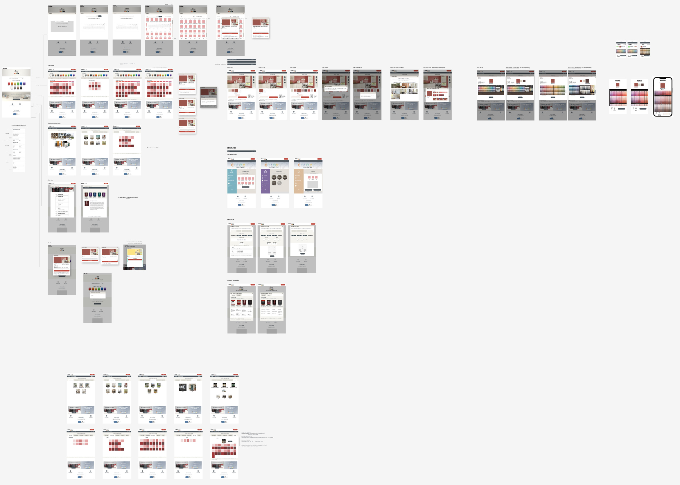
I maintain a final set of files specifically for Development and QA. This ensures that any refinements made during implementation are captured in real time, giving QA a single source of truth throughout the build. Maintaining this branch keeps engineering aligned with the most current design files and supports a smoother, more accurate release process.
Let’s Build Something
I collaborate with teams pushing the boundaries of design, technology, and storytelling.
Get in Touch